Are you sick of arguing with people who design user interfaces? Do you want to make a user interface that looks good and gives people useful information? You now have it! The mistakes I will talk about below are some that can go wrong when designing a user interface. These rules will help you make user interfaces that your target audience loves, no matter how experienced you are or how new you are to the field.
Don’t use too many colors
There would be no aesthetically pleasing or meaningful UI design without color. However, the experience could be ruined if there are too many colors. The use of color requires careful balancing and consideration.
Don’t make your user interface look like a crayon box. Although eye-catching, vivid hues often confuse and divert customers instead of attracting them. Create cohesion and consistency by sticking to a small number of colors that represent your brand.
Think about how the different colors make you feel. A color can make you feel a certain way. To make your design stand out, pick colors that match your brand’s tone or the feelings you want people to have when they see it.
Colors should be selected with accessibility in mind. Make sure there’s enough contrast between the background and the text so that everyone can read it, especially those with visual impairments.
You may create a more aesthetically pleasing interface that also enhances user experience by utilizing colors carefully and thinking about how they will affect usability and accessibility. Don’t go crazy with the hues, okay?
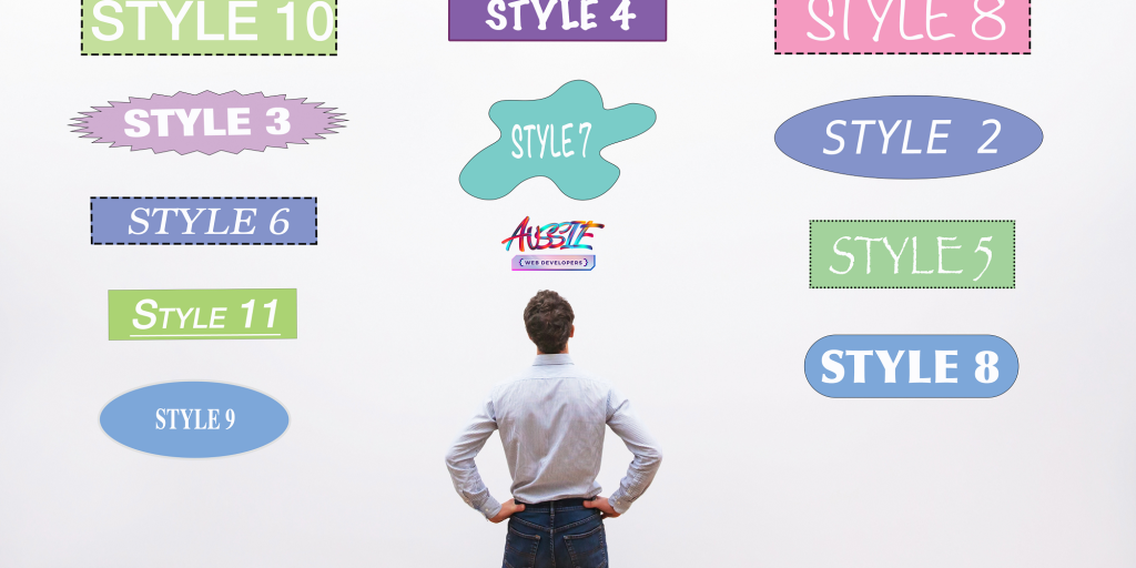
Avoid using too many different fonts
Fonts matter in UI design. It’s tempting to experiment with different typefaces, but too many on a screen can cause visual chaos and make your design look unprofessional. Creating a cohesive user experience requires consistency.
Multiple fonts make designs look cluttered and confuse users by sending mixed messages about the order of information. All of the typefaces have their own story and personality. If you pick one or two fonts that go well together, they will be clear and easy to read.
Also, avoid employing too many fonts for efficiency. Multiple web fonts slow down website loading, which frustrates users who want speedy information.
Instead, use typography methods like weight, size, and spacing variations within a font family to add visual interest while keeping consistency. This strategy keeps your UI design harmonious without overwhelming the user with typographic choices.
Choose fonts sparingly for your UI design. Limit yourself to a few complementary types. Doing so will improve readability and maintain a professional interface without affecting performance or confusing users with contradictory visual cues.
Don’t use complex graphics
UI design should be simple. Complex graphics are a big error. While rich graphics and detailed images may be stunning, they might hamper user experience.
Complex graphics might slow down your website or app, frustrating consumers who want speedy responses. Many elaborate designs might be overpowering and distracting, making it hard for users to focus on your interface’s essential content or functions.
Avoid intricate graphics and choose clean, simple designs that stress usability. Use basic forms and icons to communicate without overwhelming users. Sometimes little is more in UI design.
Avoiding complicated graphics improves interface efficiency and usability. Clean and uncomplicated designs make your app or website easy to use.
Use basic UI visuals—your users will thank you!
Keep it simple
In today’s fast-paced digital environment, UI design must be simple. Users desire a simple, easy-to-use interface to achieve their goals quickly. Simple UI design is important for these reasons.
An overly complicated UI might frustrate users. When too many things compete for attention, people can’t focus on what is important. Simplifying your design creates a pleasing layout that directs consumers through the app or website.
Simplicity makes things easier to use. Your UI should be easy to use right away. People may not want to use your product if it has complicated designs or features they don’t need. Improving the design and cutting down on unnecessary steps creates a smooth user experience.
To improve the speed and performance of an app or website, keep things as simple as possible. Because of unnecessary images or animations, a slow user experience can make people unhappy and make them give up on the product.
Consistency in design across platforms helps users feel familiar with your experience on desktop and mobile devices.
Simplifying UI design improves usability and reduces cognitive load, allowing users to quickly achieve their goals without feeling overwhelmed.
Use common UI elements
A key UI design guideline is to employ common elements. Users recognize these components, which help interfaces feel consistent. Common UI features let consumers browse your app or website without confusion or overwhelm.
To illustrate, consider buttons. Buttons enable user interaction with your interface. Their function and identity should be obvious at first glance. Unusual or overly inventive button designs may look nice, but they can confuse consumers with regular button patterns.
Another typical UI element is the navigation bar. This horizontal strip at the top of a webpage or app screen links to different parts or pages. Deviating from this typical style could hamper usability because users expect this feature in most interfaces.
UI features like checkboxes, dropdown menus, sliders, and tabs serve distinct tasks. These elements ensure that your design meets user expectations and streamlines interactions.
Designing unique experiences requires ingenuity, but it’s also necessary to stick to UI conventions. Combining innovation with familiarity will create a more user-friendly interface.
Follow the platform guidelines
Following platform guidelines is crucial when creating a user interface (UI). Each platform has its own design guidelines and concepts, whether you’re developing for iOS, Android, or another.
Following these standards ensures that your UI design matches the platform’s look and functionality. This makes customers comfortable with your app or website and improves their experience.
Apple gives specific recommendations on icon sizes and navigation patterns for iOS designers. Following these criteria, you may develop a UI that works with other iOS apps and is intuitive for iPhone and iPad users.
Google’s Material Design Guidelines for Android provide color schemes, typography, and layout advice. These rules ensure your software looks good on Android smartphones and is consistent across screens.
You risk confounding consumers who are used to using apps by departing from the platform’s standards and design patterns. This can frustrate customers and make them leave your app or website.
Before starting UI design, read the platform’s guidelines for your project. So your UI fits perfectly into that platform’s ecosystem, learn its best practices.
Remember, by following these rules throughout your design process—from choosing icons to spacing elements—you’ll create an excellent user experience adapted to each platform.

Make sure your buttons are big enough
Button size is commonly disregarded while building a user interface. Your website or app needs buttons to guide people and allow interaction. However, if they’re too small, users may have trouble tapping them, causing annoyance and usability concerns.
To provide a smooth user experience, utilize large buttons. Consider finger size and touch accuracy when choosing a button size for your design.
A minimum button size of 44 pixels by 44 pixels is recommended. This allows users with larger fingers to tap buttons without mistakenly touching adjacent items.
Think about the context in which your buttons will appear. To accommodate different screen sizes and touch targets, you may want to increase their size in a touchscreen-focused mobile app or website.
Make sure your buttons are big enough to increase usability and user experience. This apparently minor detail can change how consumers interact with your interface! So remember: bigger UI buttons are better.
Use whitespace wisely
Whitespace in UI design is often overlooked but powerful. Empty space between webpage or app items. Designers often think whitespace should be filled with content, but it should be used strategically.
Readability is a major benefit of whitespace. Users become overwhelmed by too much information in a tiny space. Giving your design space lets people focus on the most critical parts.
Whitespace enhances readability and gives your design hierarchy and organization. Space out items and sections to better guide users through the UI.
Whitespace also makes your design look clean and minimalist. Modern and sophisticated interfaces can be created by eliminating visual clutter.
Whitespace shouldn’t be overdone too. Too much empty space might make your design look empty. An attractive UI requires a balance between filled and empty spaces.
Whitespace can make your UI design stand out when used appropriately. On your next project, remember that less is more when it comes to whitespace design!
Test your design on different devices
Testing your design on numerous devices is essential for usability and effectiveness. It’s crucial that your UI design works across smartphones, tablets, and desktops due to the large range of devices available nowadays.
Testing on numerous devices is vital because each has a different screen size and resolution. What looks amazing on a desktop may not look as good on a smartphone. Test your design on different devices to find layout or formatting issues.
User experience should be considered when testing on multiple devices. Operating systems and browsers may have quirks and limits that affect how people interact with your UI. You can verify your UI design works on all devices and platforms by testing it thoroughly.
Additionally, testing on numerous devices lets you evaluate your design’s performance. Laggy animations and loading delays might frustrate consumers. Run testing on multiple devices to find performance bottlenecks and optimize.
By testing your UI design on multiple devices, you can ensure a consistent and engaging user experience. Don’t skip this crucial design step—test widely to provide your users with the best experience.
Conclusion
Today’s fast-paced digital world relies on UI design to provide a great user experience. By avoiding common mistakes and adopting best practices, you may develop user-friendly and visually beautiful interfaces that last.