In the dynamic world of web development, CSS has evolved dramatically! CSS (Cascading Style Sheets) has transformed website design and styling. CSS has advanced from simple text formatting to complicated page layouts, giving developers strong tools and strategies.
We’ll examine Grid and Flexbox, two breakout web design layouts. These unique capabilities provide website designers unprecedented ability to create flexible and attractive websites. Whether you’re a seasoned developer or just starting out, understanding Grid and Flexbox is crucial in today’s ever-changing digital market.
The Evolution of CSS
CSS has evolved since its 1990s foundation. It was initially used to format web pages by changing font colors, margins, and borders. CSS had to adapt to modern web design as websites became more complex and interactive.
CSS2 improved page positioning and multi-column layouts. This gave developers more flexibility over website structure and presentation. CSS3 really got things going. This big upgrade introduced many new attributes and selectors that changed website building. Box shadows, gradients, and rounded corners were some CSS 3 visual advances.
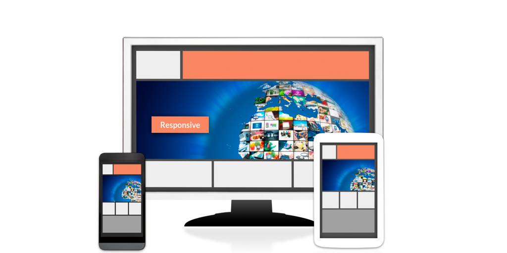
CSS3 added media queries, enabling responsive web design. Today, developers can build websites that work across devices and screen sizes without affecting user experience and now create layouts as well as styles. Modern layout tools like Grid and Flexbox allow designers to easily build dynamic websites.
It’s amazing how CSS has evolved from a simple text styler to a vital aspect of current web development. Technology is advancing rapidly, so we can only think about what new improvements are coming!
Introduction to Grid and Flexbox Layouts
CSS grid and flexbox layout techniques have transformed web page design. We may easily design sophisticated, multi-dimensional layouts with the grid. Its grid-based design lets items be arranged in rows and columns for exact arrangement.
Flexbox is for basic, one-dimensional layouts. It allows flexible box model behavior, making horizontal and vertical container alignment easy. Grid and Flexbox each have advantages. Grid is perfect for complicated website layouts with several parts and grids within grids. Flexbox excels in fluid, flexible responsive designs.
Grid and Flexbox handle element spacing differently. You can define explicit gaps between Grid rows or columns using the gap attribute. Flexbox allows margin attributes to space elements. Grid and Flexbox are easy to implement on websites. Simply apply CSS properties to HTML elements with appropriate values.
Popular websites have used these current layout approaches to produce appealing designs that work across devices and screen sizes.
Understanding the Differences Between Grid and Flexbox
The introduction of CSS Grid and Flexbox layouts has given developers new tools to create dynamic and responsive websites. While Grid and Flexbox offer powerful layout options, it’s crucial to know their distinctions.
Grid lets you construct easily modified rows and columns for two-dimensional layouts. It allows sophisticated grid designs with precise element placement. Grid-template-areas and grid-gap let you develop visually appealing websites without frameworks or libraries. Flexbox distributes space among flexible elements in a container for one-dimensional layouts. It excels in responsive designs that adjust to space. Flex-direction and flex-wrap let you rearrange or wrap items across lines.
Alignment distinguishes Grid and Flexbox. Grid allows fine-grained horizontal (justify-content) and vertical (align-items) alignment within grid cells. Flexbox uses justify-content and align-items for single-axis alignment. Support for nested elements is another difference. Grid and Flexbox support container nesting, but they govern child elements differently at different nesting levels.
Both methods are valuable alone, but they work well together in some situations. Grid can establish the main layout areas of your website, whereas Flexbox can govern item positioning within those sections.
Pros and Cons of Using Grid and Flexbox
CSS Grid and Flexbox can transform your website layout design process. Like any instrument, they have pros and cons.
Start with CSS Grid’s benefits. A major benefit is its simplicity of creating sophisticated, multi-dimensional arrangements. Grid-template-areas let you visually organize information into parts without HTML.CSS Grid’s responsiveness is another bonus. Define flexible columns and rows to guarantee your layout adapts to multiple screen widths. This makes it ideal for responsive designs that look fantastic on desktop and mobile devices.
Flexbox is best at one-dimensional layouts like navigation menus and single-column text. Its simplicity makes prototyping and browser implementation easy. Flexbox also offers flexibility. Containers allow you to regulate element growth and shrink, making them excellent for vertical and horizontal alignment. There are disadvantages, though. Older Internet Explorer versions support CSS Grid and Flexbox less. Supporting IE users may require fallback solutions or layout changes.
CSS Grid has a higher learning curve than Flexbox but offers more advanced functionality for complicated layouts. Understanding grid lines, trains, areas, etc. may take time.
How to Implement Grid and Flexbox on Your Website
Grid and Flexbox improve website layout and design. To use these powerful CSS capabilities, you must understand their fundamentals.
In a grid layout, you designate a container element as the parent and then give its column or row count. You can simply design elaborate layouts. Grid regions let you place specialized material in specified sections. Flexbox is for one-dimensional layouts like navigation menus and flexible content containers. The display property of an element can be adjusted to flex to position and space its child elements.
Before implementing Grid or Flexbox on your website, decide which layout system is preferable. Consider browser support and project needs before choosing. After choosing, define Grid or Flexbox CSS attributes on container components. If needed, target containers’ items with CSS selectors.
Remember that Grid and Flexbox provide features for layout customization. Try these properties until you get what you want. When adding a CSS feature, always test in several browsers. Your designs should seem consistent across popular browsers before going live.
Learn how to use Grid and Flexbox layouts to construct more attractive, clean-coded websites. Don’t hesitate—use these flexible tools today!
Examples of Websites Using CSS Grid and Flexbox Effectively
1. Airbnb uses CSS Grid to provide attractive and intuitive search results. They can organize several listings in grid-based layouts, making it easy for customers to browse housing possibilities.
2. Slack uses CSS Grid and Flexbox in its interface. Grid-based layouts help them organize chat panels and navigation menus on the screen. Flexbox ensures element alignment in these components.
3. Dropbox – Dropbox uses CSS Grid and Flexbox to build responsive designs that work across devices. Their product features section uses grid-based layouts to display important information graphically and flexibly.
4. Mozilla Developer Network (MDN) – MDN employs flexbox to space code snippets, headings, and paragraphs consistently. To promote readability, text should flow smoothly without unpleasant gaps or overlapping sections.
5. Netflix uses CSS Grid’s sophisticated layout to create elaborate homepage designs. Grids let them match photos with text overlays and preserve responsiveness across screen sizes.
6. Trello uses a flexbox and grid layout in its project management tool interface.
Drag-and-drop task cards into list columns simplifies management. Flexbox lets you reorder without disrupting the framework.

Conclusion
CSS has grown from a simple style language to a sophisticated tool that revolutionizes website design. The advent of CSS Grid and Flexbox layouts gives developers additional creative power.
Grid and Flexbox layouts differ. Grid is perfect for intricate, multi-dimensional layouts with accurate alignment and spacing. Flexbox creates responsive single-direction layouts.
Grid and Flexbox have pros and cons. Grid is superior for grid-based designs, whereas Flexbox supports dynamic content better. Your project’s needs determine which one to utilize.
Grid and Flexbox are easy to implement on websites. You can use these layout systems immediately by adding CSS code to your stylesheets.
Many websites have successfully used CSS Grid and Flexbox. These technologies are changing web development, from e-commerce sites utilizing CSS Grid to news websites organizing articles with Flexbox.
As web development evolves, CSS techniques will improve, making developing attractive websites easier than ever. CSS Grid and Flexbox provide unlimited web design creativity and innovation.
